Design System
The design instruction to unify visual languages across digital platforms
Project Summary
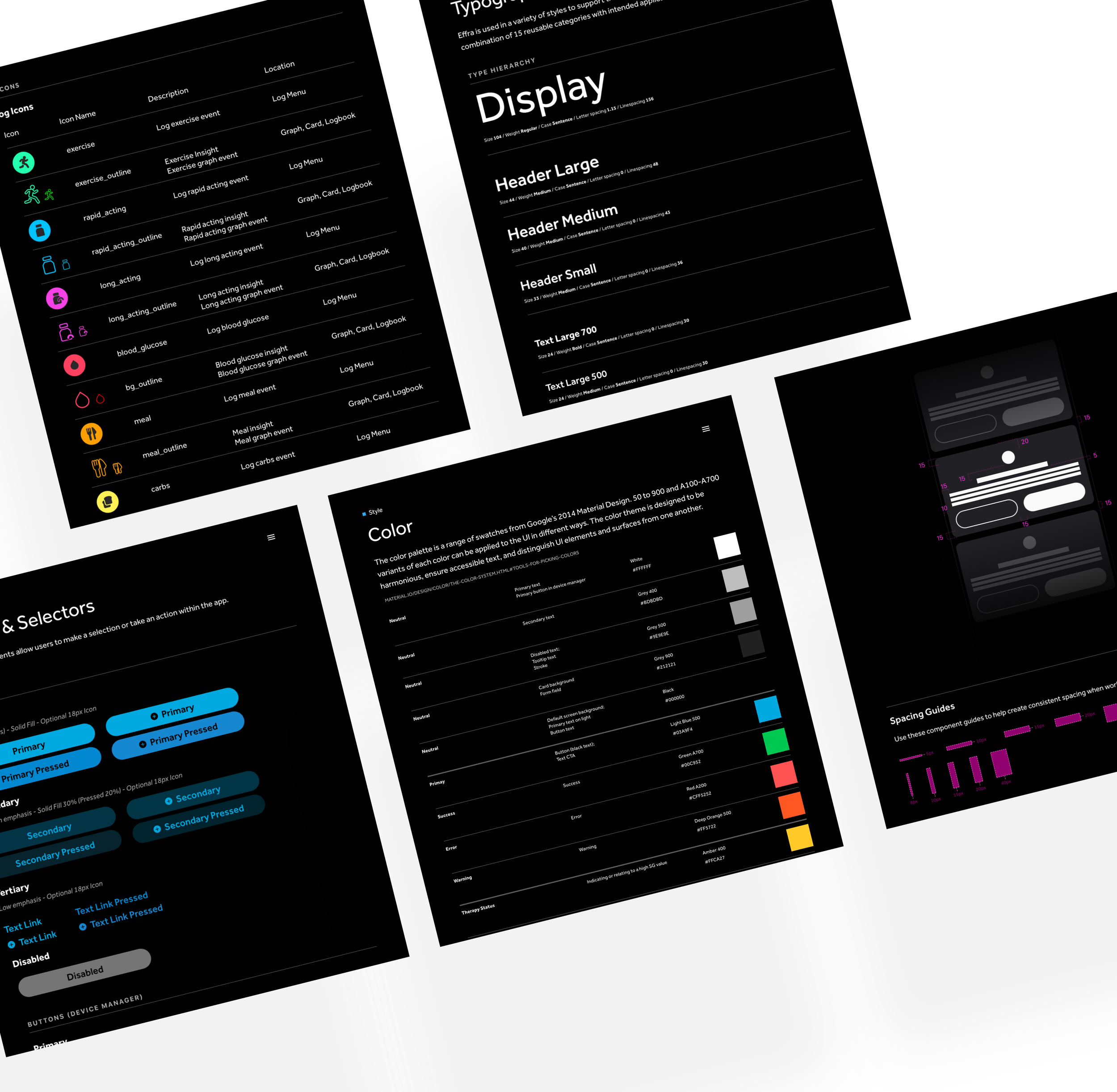
Design System is a collection of design instructions on how our digital products (mobiles, watches, and insulin devices) should be built. It contains reusable components, guided by clear standards and usages, that can quickly be assembled to make any number of applications. The need for them goes hand in hand with the need for scale, efficiency, and consistency in design.
Project Scope
Evaluated the existing mobile UI elements and identified any visual problems. Defined general guidelines and provided UI examples following the Atomic design. Delivered a set of pre-built UI elements in Adobe XD
My Role
In this six-month project, I contributed to helping the UX Team in creating a design system by following standard mobile guidelines. I worked on identifying any UI problems from the existing designs, then updating UI elements to meet the design style guide. At the end of the project, I delivered a set of pre-build UI elements in Adobe XD and shared the final design system with all stakeholders.
Team
Designers, Engineers
Tools
Adobe XD
01. Problem Space
When I joined the UX team, I noticed that UI elements were used inconsistently across all platforms because there was no Design System before 2020. So I took the initiative to start analyzing all the UI elements from previous releases and define the problems.
Problems:
Different character styles were used across platforms
Mixed sizes of icons with various visual treatments
A single color displayed in different hex values across platforms
Duplication of common components
Visual languages and interactions were inconsistent
How does your design solve the problem?
Following the Atomic system, our team was tasked to create a design system to provide standards to manage design at scale by reducing redundancy while creating a shared language and visual consistency across different pages and channels.
02. Design Rational
We started with research, looking at great examples of style guides from giant companies like Google, IBM, and Apple. Then, identify key requirements that must be included in the design system. While we building out the design system, we asked stakeholders and engineers to join our meeting and provide feedback. Below were the final updates:
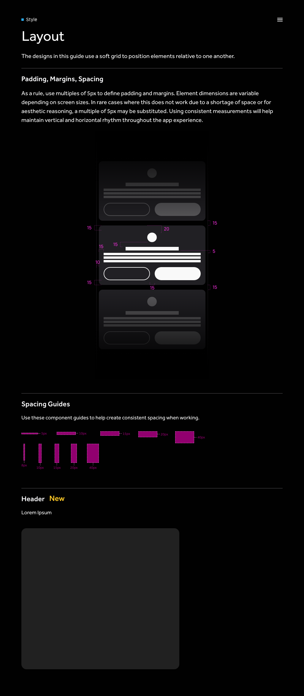
Change from 10pt to 8pt grid system
In the research, we discovered that using an even number of columns like 8 makes scaling for various devices much easier and more consistent. Also, the most popular screen sizes are divisible by 8pt, making for an easy fit by multiples of 8 to create better responsive designs.
The basic principle of the 8pt Grid is that you use multiples of 8 (8, 16, 24, 32, 40, 48, etc…) to margins, padding, and sometimes dimensions, such as the elements inside of your design.
Update hex color to follow WCAG
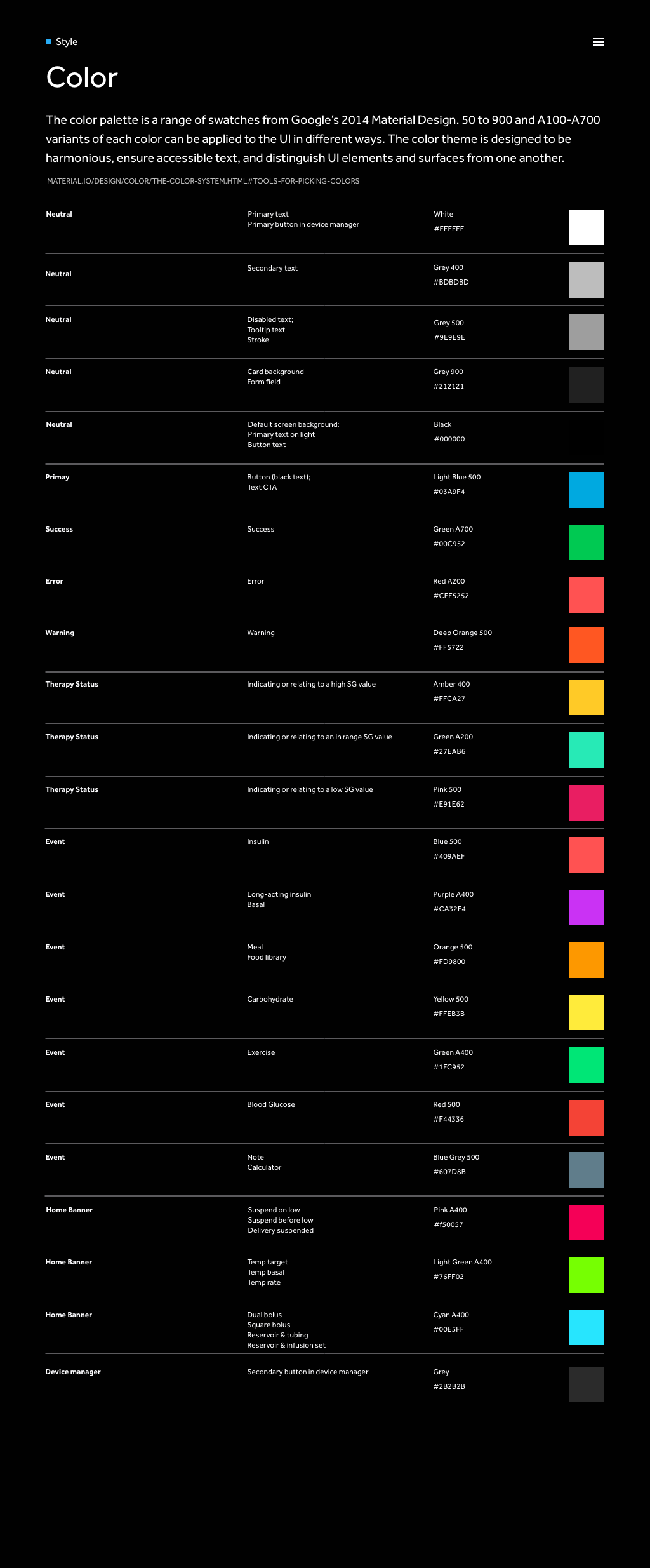
During the evaluating phase, we discovered that a single color was coded with different hex values across platforms, which leads to redundancy and inconsistency. Therefore, we started to test all colors and updated the colors that didn't get passed WCAG 2.1 AA guidelines for usability. In the final color plates, we included the title, the usage, and the hex value.
To help engineers understand color contrast, we created an example of text contrast and highlighted the contrast value has to be above 4.5:1
Unify character styles and icon styles
By organizing typography, we tested the character styles on various screen sizes and created a rule that the text can't go below size 17 due to poor readability. Also, We updated the San Fransico font to the Effra font to match the existing branding guideline.
By organizing icons, we standardize all icon sizes to 24px x 24px, following google icon guidelines to make a better practice and make them all responsive in the component library.
Create a series of states for buttons
Previously, all the call-to-action buttons only had a normal state. Since our users interact with the buttons often and to create a better experience, we decided to create a series of states when users interact buttons.
03 Solution


8 Points System
Use an 8pt grid system that uses uniform elements and spacing to encourage consistency across platforms, environments, and screen sizes.
Incorporate the STARK tool in UI management workflow as an additional check
Ensure colors pass the WCAG guideline by using the Stark plugin
Quickly Assemble Layout
Adding various components and icons in the library for design team to quickly assemble a layout with consistent and scalable designs.


Reflection
As we were building the design system, the eng team provided feedback before we launch to internal stakeholders. It was a great point to provide additional information such as a name convention and the usage of the element. That way it would be more productive and efficient for engineers to implement in into code.
It would be better to have the eng lead participate in our design system creation cycles as they were partners to help us understand the discrepancy and what we should include helping both parties work efficiently.


