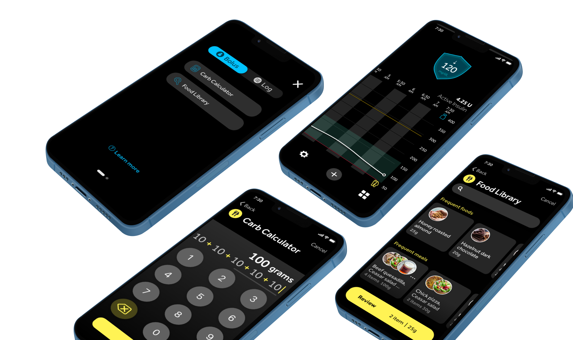
Sugar AI is an app designed for diabetic patients to calculate insulin dosing and deliver insulin more discreetly.
Project Summary
Designing an ecosystem of features for Glucose Monitoring for people with Diabetes. This system includes remote insulin delivery functions that allow users to calculate how much insulin is needed and use that data to communicate with the insulin pump to deliver insulin simultaneously.
The key features I designed for the app are : Carb Calculator, Food Library, and Remote Bolus.
Project Scope and Deliverables
This project was started from March 2021 - March 2022, aiming to launch in 2023.
I worked with the UX research team to complete two user testings session with 44 participants, participate in all sessions and provide UX/UI recommendations for the iteration.
After completing the iteration, I delivered high-fidelity UI screens, UX flow charts, style guide, and interactive prototypes.
My Role
As a lead UX designer, I worked with cross-functional teams (project managers, engineers, human factors, and clinical trainers) from exploration to validation and iteration to execution.
Tools
Adobe XD, Overflow, Illustrator, Photoshop, Jira, Miro
UX Design process
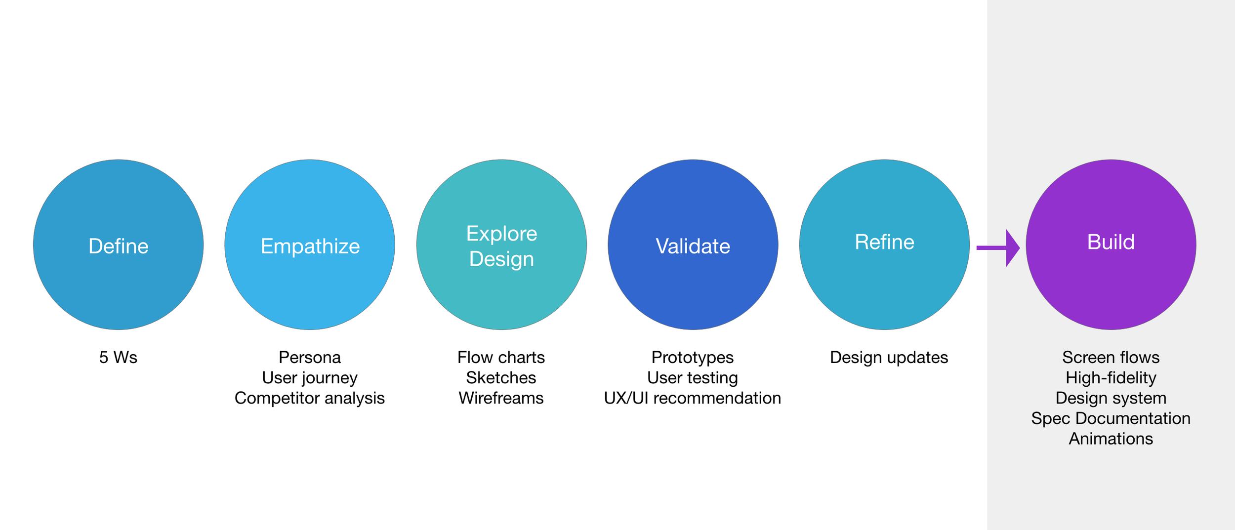
After knowing this was one year project, I broke down our timeline in each milestone, following the UX design process. We covered in our design sprint included define, empathize, explore, design and iterate. All those stages were covered and led to the final stage, the design handoff.

01 Define
After researching our competitors and looking at their business profiles, the main takeaways were:
On the market, two types of controllers can deliver insulin: insulin pumps and smartphones. Our team decided to use a smartphone as a controller as the users wanted to deliver insulin in a discreet way.
In order to have the system calculate insulin units, it is crucial that users must know their total carb values. Our competitors didn’t have features to optimize the experience on how to find their carb values in a faster and easier way. Our team decided to enhance this part of the experience.

02. Empathize
I joined the team after the define phase was completed, but I felt there were some missing pieces to help the team align. So I took the initiative to create a persona and user journey. Then I worked with the project manager to define essential features and user stories (from our persona)

03. Explore
I sketched the primary user flows to identify the two entry points for calculating insulin dosing and a screen to lead users back to the main flow. The paths highlighted in orange were where involved multiple clicks with given user scenarios.
Then I collaborated with stakeholders on the whiteboard sketching with annotations of what should be displayed on the UI.
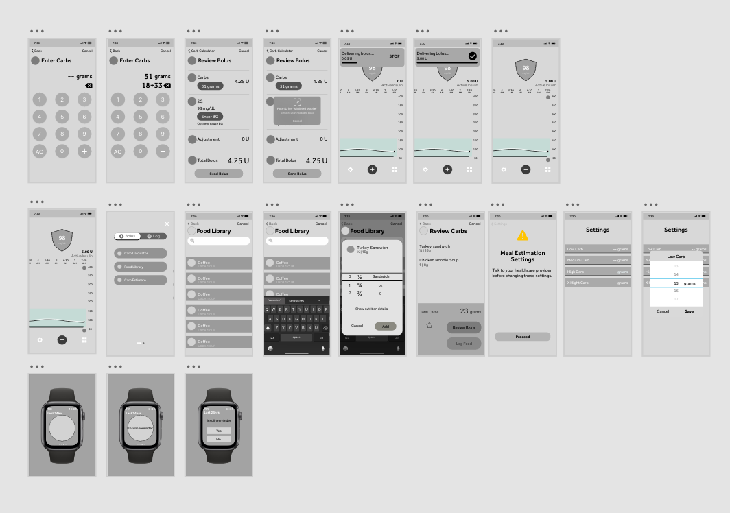
After the main flow was aligned with everyone’s vision, then I started to draw out wireframes for the two entry points: carb calculator and food library flows.
Wireframes, interview questions, prototypes
After aligning with stakeholders on the testing strategy, I moved the sketches to Adobe XD to build wireframes and prototypes, along with contributing the interview questions.
-> click here to play prototypes
04. Validate
We participated in 44 user testing sessions to understand patient preferences and use cases for two carb methods, the goals were:
Understand patient perception of carb calculator and food library functionality
Identify usability concerns throughout
After each interview ended, we had debriefed meetings to share and discuss what we had observed.
05 Refine
After gathering qualitative feedback from users, our team went back to the design phase to refine the flows and the UIs.
Final Demostration
After making refinements, I recorded the prototypes to demo how the flow should work and shared it with the team and engineers.
Carb calculator does the math for you!
The new carb calculator feature allows users to calculate the total amount of carbs effortlessly. It automatically runs the calculation in the background while users tap " + " to calculate carbs in a meal. Users can also select and edit individual values that are previously entered by dragging the horizontal bar and hitting the delete button.
Food library finds the carb value for you!
The food library is a food database that helps users determine how many carbs are by searching names and customizing serving sizes. Users can save their meals in my favorites for subsequent use.
Remotely sending insulin from my smartphone.
A remote control feature allows users to use their smartphones to deliver insulin from the pump. Users navigate to the Review Bolus screen as one last confirmation step before injecting insulin.

At the end of this project, we hand off high-fidelity mocks, screen flows, and style guides to engineers so they can start implementing designs in Flutter. Each flow was created as a user story in the Jira software platform and assigned to me to support the engineering team.
06 Build
Style Guide
The style guide for this project referenced the Design System project, in which I was involved in creating rules and guidelines for color choices, gride, and components.


Reflection
Though I was more drawn to creating wireframes and prototypes, I learned that the most critical part was the user testing process. For example, usability testing was essential in finding errors and seeing things from a different perspective. For example, the biggest flaw in the carb calculator flow was users wanted to edit a single value without deleting subsequent values. After learning from users, I redid the carb calculator interactions to strike what they needed.
Besides the usability test, I also found the A/B test was another good way to test which version of the menu screen participants preferred. All of them preferred the alternate version. This was an excellent reminder to put my personal tastes aside and keep my users front and center.
Collecting constructive criticism was another important part of the process. Asking other UX-minded peers gave me ideas on improving the app in future iterations.
If I had more time, I would also like to increase the accessibility of the app, especially for older users. My app was geared toward anyone using insulin pump therapy. Therefore, older users who may be less tech-savvy and/or more impaired need to have their needs addressed as well.


