
Make it stand out
Home page
Natural History Museum Home Page
Project Overview
I led the UX optimization of the Natural History Museum’s homepage to resolve friction points in the visitor journey. The primary objective was to bridge the gap between Marketing’s goal of boosting ticket sales with the visitors' need for an intuitive and educational interface.
Key Objectives:
Conversion Optimization: Redesigning key flows to boost ticket sales.
Scalability: Extending the UI framework to accommodate new features while maintaining a cohesive visual language.
Stakeholder Alignment: Balancing the technical requirements of the business with the high expectations of a global audience.
Team
Solo UX Designer
Tools
Figma, Visilly, Drupal CMS
My Biggest Challenge: Establishing UX Maturity in a Legacy Environment
As the first UX Designer for the Natural History Museum, I inherited a project with significant structural and cultural hurdles. The challenge was not just redesigning a homepage, but building a UX ecosystem from the ground up while navigating the following constraints:
Organizational Misalignment: Deep stakeholder conflict between departments regarding revenue goals vs. user experience, with no existing framework for decision-making.
Lack of Resources: Operating as a "team of one" without a dedicated Product Manager and dedicated CMS publisher to roll out the new changes, this requires me to act as both strategist and executor.
Technical & Design Rigidity: Severe restrictions on modifying the existing UI and user flows due to legacy system limitations and internal resistance to change.
How I Navigated the Constraints:
The Framework: Since no UX framework existed, I introduced a lightweight Discovery & Alignment phase, using stakeholder interviews to turn "complaints" into "requirements
The Compromise: To respect the "very little-change" UI restrictions, I focused on Information Architecture and Content Hierarchy—improving the user's path to purchase without requiring a total code rewrite.
The Advocacy: Without a PM, I took the lead on defining Product Vision, creating a roadmap that showed stakeholders how UX improvements directly lead to Marketing revenue.
01 Define UX Problems
Approaches
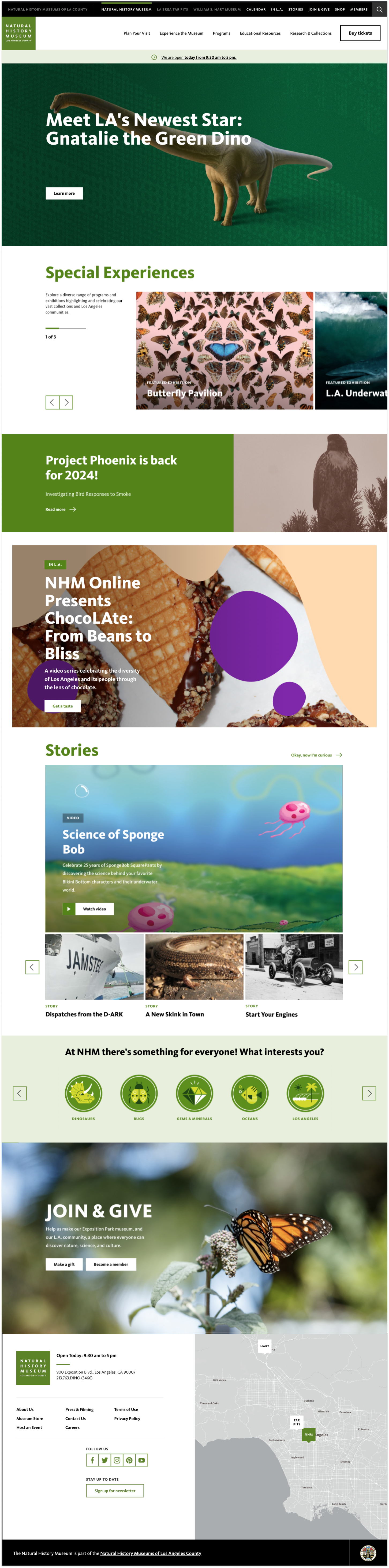
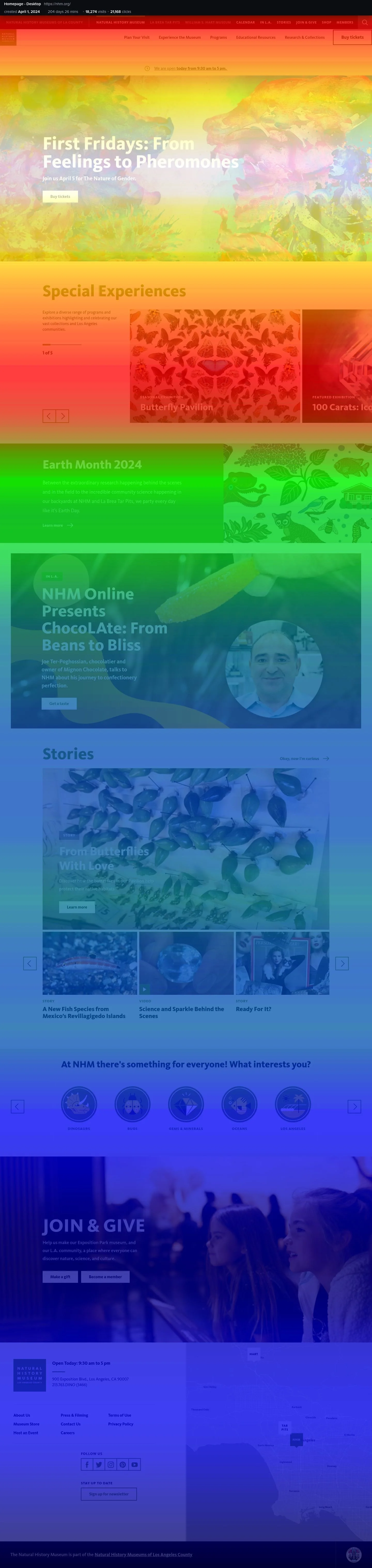
I let the discovery and alignemt meetings to met with all the stakeholders to discuss the problems I notcied on the home page. The left is the current home page and the right is picture shows the popularity of the content.
Problems
Lack of promotional space on the most view section to increase ticket sales
Confused hierarchy from the top to bottom
Poor usability and discoverability for first-time visitor
Objective
Design flexible components for dynamic content on the top section
Reorganize content based on user priority and business goals.
Streamline the "path to visit" by implementing a clear visual hierarchy for essential info and pages.
02 Research
Pior Research Preparation
I asked the team to provide any user metrics information to know how we doing and do determine the critical changes. We started to set metrics to track conversion rates, scroll heatmaps, and click activities. This allowed us to visualize user behavior, identify areas for improvement, and continuously monitor performance to ensure data-driven design decisions.
Challenges
Lack of opportunity to promote new events and exhibitions
Confused content structure and poor content hierarchy
Lack of user engagement on the contents
Lack of CTA
Objectives
Improving drive revenue and attendance.
Encourage content engagement
03 Design
Pior Research Preparation
I asked the team to provide any user metrics information to know how we doing and do determine the critical changes. We started to set metrics to track conversion rates, scroll heatmaps, and click activities. This allowed us to visualize user behavior, identify areas for improvement, and continuously monitor performance to ensure data-driven design decisions.